RIKA HOME DESIGN — Living trends of today and tomorrow
Interior stylist Eileen Hoschek and interior designer Sara Ludwig reveal which styles and colours make for particularly beautiful living. Always included for that special feel-good factor: a RIKA stove.


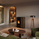
RAW MATERIALS
sustainable & timeless
Raw, rough, coarse, unfinished or unplastered – materials and surfaces in their untreated form, with visible signs of use and a natural patina become eye-catchers. Raw materials as design elements and handmade unique pieces are reflected in various living trends such as industrial or shabby chic, vintage or used look.
“Coarse and untreated materials add the finishing touch to a modern interior and give an extra dose of character. Materials such as concrete or wood can be combined with any furnishing style and any colour palette. A large wooden bowl made of rootwork or a modern sidetable made of concrete add something special, exciting and timeless to any room.” Eileen Hoschek
“The goal is to create spaces that are sustainable while meeting personal needs. In addition to the natural choice of materials, upcycling is also a big theme in interior design. Old or used objects, furniture or materials are reused to give them a new function or a new aesthetic expression. Instead of throwing things away or disposing of them, they are deliberately redesigned or transformed.” Sara Ludwig


JAPANDI
Harmony & Simplicity
The Scandinavian-Asian furnishing style combines a warm feel-good atmosphere with strict, reduced aesthetics. Simple, natural elements create a stylish mix with a casual character. Behind this are the two concepts typical of the country, Wabi Sabi, the longing for simplicity, and Hygge, the combination of functionality and modern cosiness.
“Japandi combines the traditional elegance of Japan and the cosy modernity of Scandinavia. Through muted colours, clear shapes, small but fine details and the influence of natural elements, the style can be realised in your own home with ease. The basic rule here is less is more. The Japandi style does not appear cool at all.” Eileen Hoschek
“The colour palette in the Japandi style mainly comprises natural tones in combination with light wood. Small colour accents can be set through elements in terracotta. The Japandi style creates a calming and harmonious environment that relaxes the mind and creates space for clarity and concentration. Acoustic panels in a slatted look are a beautiful highlight in the room and fit perfectly into this style world. They can be used in a variety of ways and also provide pleasant room acoustics.” Sara Ludwig


MONOCHROME
Coolness & elegance
Living room design in black and white, grey or beige – that is monochrome. The colours used are clearly visibly related to each other. A dominant colour is reflected in a wide variety of furnishings. The simple, elegant shade of grey, for example, is considered a “soft” variant of monochrome furnishings, while neutral shades of beige, for example, appear warmer and friendlier.
“The combination of black and white and clear patterns makes this trend always look tidy and cool, but at the same time exciting and elegant. Moreover, this trend is probably more timeless than any other. Even if you lack the courage to use colour, choosing a black and white combination is always the right choice. With grey tones and materials such as natural wood, the hard black and white contrast can be ideally contrasted without losing the uncluttered look.” Eileen Hoschek
“Monochrome interior design refers to the design of interiors where a single colour in different shades is used as the dominant element. In a monochrome design, textures and materials are particularly important. In the desired colour scheme, different fabrics, textures and materials can be experimented with to add depth and dimension to the space. The interplay of light and shadow can also break the monotony. Use different lighting options to influence the mood of the room.” Sara Ludwig


TREND COLOURS
Tranquillity, adventure or playfulness? Whether pastel, earthy, gaudy or neutral – colours with their many nuances and effects are the translation of our living environment. They provide meaningful accents in our homes.
COLOUR GREEN
Nature & Life
“Shades of green can be combined with almost any colour and yet always appear completely different. The colour spectrum is huge. Whether a muted olive green, bright emerald green or noble sage green, depending on the intensity and quantity of the green elements, a wide variety of living worlds can be created. Together with wooden elements, they always they always convey a certain naturalness. The shades accentuated with grey in particular, in the form of upholstered furniture and accessories, create a special atmosphere and, at the same time, lend the room a certain peace and harmony.” Eileen Hoschek
“Teal is a mixture of blue and green and is named after the plumage of the teal, a species of water bird. Teal is a popular trend colour that creates a refreshing yet elegant atmosphere in interiors. It brings freshness and energy into the room and can be used as a wall, furniture or accent colour. In combination with green plants, it also provides a pleasant indoor climate.” Sara Ludwig


COLOUR BLUE
individual & varied
Depending on the shade, you can create the most diverse worlds with the colour blue. Light and bright tones in combination with light wood create a fresh and modern Scandinavian look, while dark and heavy tones in combination with black or dark wood give the room something very noble and elegant. Blue accessories such as cushions, rugs, vases and murals can give the room a whole new look without much effort. Together with metallic elements, such as candlesticks or brushed brass picture frames, blue always looks modern, exciting and casual. Eileen Hoschek
The colour blue is often used in interior design because it creates a calming, refreshing and harmonious atmosphere. Blue can be used in different shades and nuances to create different moods and effects. Trends can change and personal preferences should always play a role when choosing colours. When using on-trend colours, it's often a good idea to use them in accents, accessories or changeable elements so they're easily adaptable as personal tastes change. Sara Ludwig


CORAL COLOURS
soft & lively
“Like its namesakes, coral, this shade is super versatile, from a hint of pink to a bright orange. You can combine the shades particularly well with natural materials and natural colours, unless you like things a little more vibrant, in which case shades of green and blue go particularly well and ‘ground’ the coral colours. Coral colours leave a certain freshness in every room and make it look more interesting. Even small highlights like a vase, light fixture, cushion cover or painting are enough.” Eileen Hoschek
“The colour coral in interior design gives a room a lively and cheerful atmosphere. Coral is a mixture of pink and orange with a warm undertone. It can be used subtly or boldly depending on personal preference and the desired style of the room. Incorporate a piece of furniture in coral colour to create an eye-catching focal point – a sofa, chair or bed can be the central element of the room and make a stylish statement.” Sara Ludwig


(c) Portrait images: emotions4life